Designing the cart widget: templates, branding, copy, and custom HTML/CSS
The TackOn widget is the box a shopper sees above the checkout button, the thing that decides whether they add shipping protection, gift wrap, or a tree. This guide covers every control that changes how it looks and reads: the six widget types, the two template styles, colours and corner radius, the image uploader, the opt-in/opt-out copy pairs under Dynamic Content, the two behaviour settings that carry a compliance obligation, and the advanced HTML/CSS editor with its full template-variable list.
Who this is for
- Merchants who already have at least one charge rule live and now want the widget on-brand.
- Anyone whose widget looks wrong, or whose custom template's checkbox doesn't work.
Time needed
- 10–15 minutes for colours, copy, and behaviour. Longer if you go into the advanced editor.
You'll need
- TackOn installed and the theme app embed switched on (see Getting started: install TackOn and charge your first fee).
- At least one charge rule saved, so the preview shows a real price.
- Brand hex codes, and a logo or icon if you want the With Image style.
1. Open the customiser and read the Live Preview
Go to Settings → Cart Widget, or use the Cart Widget item in TackOn's left nav. Both land on the same page.
The top of the page is a Live Preview card: "See your widget changes in real-time as you customize. The preview on the right shows exactly how your widget will appear to customers." Under it is a tip worth passing to merchants verbatim: "Click the checkbox to see how content changes between opt-in and opt-out states." Clicking the preview's checkbox is the only way to see the opt-in copy before going live.
Below the preview sits the Cart Widget Customizer, which holds everything else in this guide.
⚠️ Heads up: everything on this page (widget type, template style, colours, copy, behaviour, custom HTML) is held in the browser until you Save. The Live Preview redraws instantly, which makes it easy to believe a change is already live when it isn't. A save bar appears at the top the moment you change anything, and the button at the bottom of the page reads Save while changes are pending and Saved once they aren't. Nothing reaches the storefront until it reads Saved.
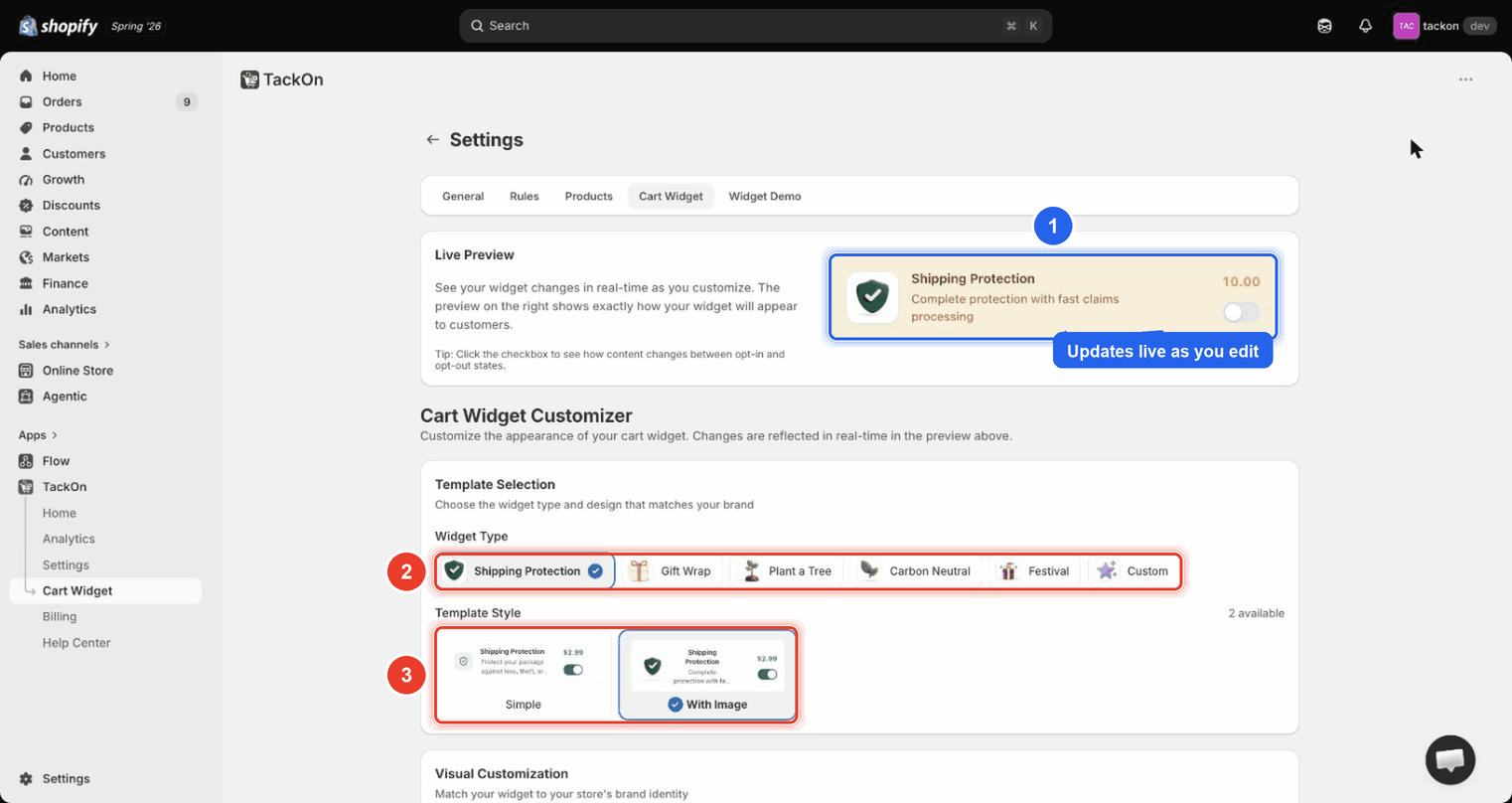
Marker 1 is the Live Preview card, which redraws as they type; marker 2 is the row of six widget-type chips; marker 3 is the two Template Style cards.
1.1 Pick a Widget Type
Widget Type is a row of chips. There are six:
| Widget Type | Typical use |
|---|---|
| Shipping Protection | Loss, theft, or damage cover added at cart |
| Gift Wrap | Wrapping and gift message |
| Plant a Tree | Round-up donation framed as reforestation |
| Carbon Neutral | Shipping-emissions offset |
| Festival | Seasonal or event-themed add-on |
| Custom | Anything else: you supply all the copy |
⚠️ Heads up: there are six widget types. Festival sits between Carbon Neutral and Custom in the chip row and is easy to overlook. If you can't find it, look again at the chip row.
1.2 Pick a Template Style
Template Style offers Simple and With Image (the badge reads 2 available). Simple is text plus a toggle. With Image adds an icon or picture on the left, which is the one to choose if you've uploaded a Widget Image.
2. Match the widget to the store's brand
The Visual Customization section ("Match your widget to your store's brand identity") is where the look is set.
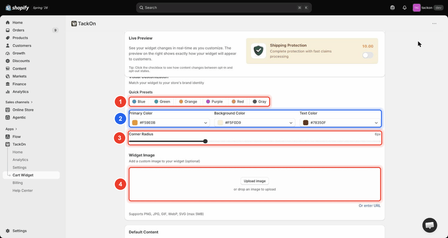
Marker 1 is the Quick Presets row; marker 2 groups the three colour fields; marker 3 is the Corner Radius slider; marker 4 is the Widget Image dropzone.
| Control | What it does | Range / limits |
|---|---|---|
| Quick Presets | One-click colour sets: Blue, Green, Orange, Purple, Red, Gray | Six presets |
| Primary Color | The accent, used for the price and the active toggle | Hex picker |
| Background Color | The widget's fill | Hex picker |
| Text Color | Title and description text | Hex picker |
| Corner Radius | How rounded the widget's corners are | Slider, 0–20 px |
| Widget Image | Icon or picture for the With Image style | Upload image, drag-and-drop, or Or enter URL. PNG, JPG, GIF, WebP, SVG. Max 5 MB |
A sensible order: start from the Quick Preset closest to the brand, override Primary Color with the exact brand hex, then match Corner Radius to the theme's buttons: 0 px reads sharp, 20 px reads soft.
⚠️ Heads up: the colour fields are Primary Color, Background Color, and Text Color. There is no field called "secondary" on this screen. (The word secondary only survives inside the advanced editor's variable list; see section 7.1.)
3. Write the default content
Under the visual controls are Widget Title and Widget Description. Each has a Use template default link beside it, and the helper text says "leave empty to use template default". If you like the built-in wording, leave both blank. Treat Use template default as the undo button: it restores the template's wording after someone has overwritten it.
4. Dynamic Content: different copy for opt-in and opt-out
Dynamic Content (Optional) ("Show different content based on checkbox state. Leave empty to use default content above.") is the single biggest conversion lever on this page, and it is easy to miss.
It splits into two columns: Unchecked State / When Not Selected, and Checked State / When Selected.
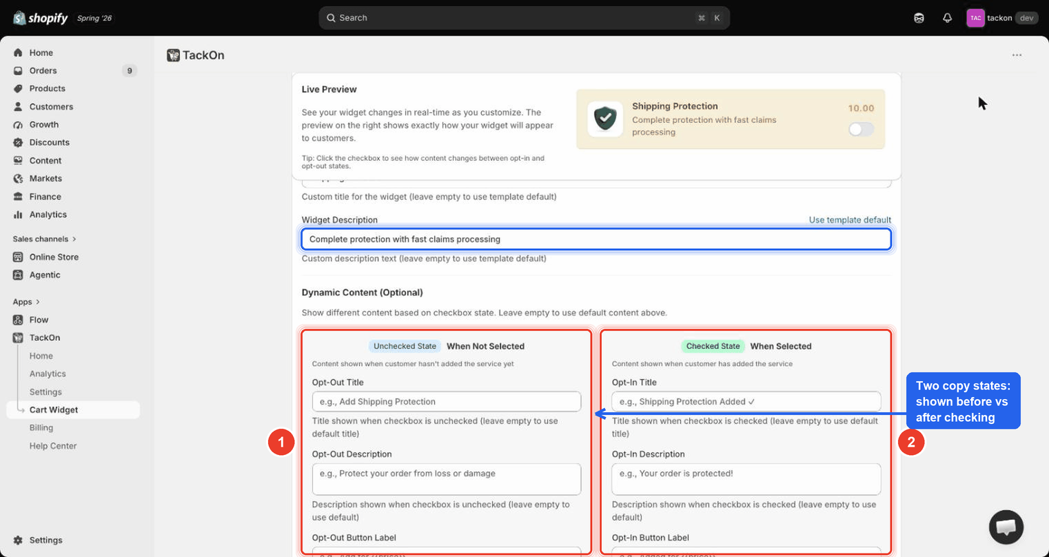
Notice that the left column is the copy a shopper sees before they act and the right column is what replaces it the moment they tick the box. Every field has a matching pair.
| Left column (When Not Selected) | Right column (When Selected) |
|---|---|
| Opt-Out Title | Opt-In Title |
| Opt-Out Description | Opt-In Description |
| Opt-Out Button Label | Opt-In Button Label |
The rule of thumb: the left column sells, the right column reassures. Left is an invitation, phrased as an action. Right is a confirmation, phrased as a completed state.
Good pairs
| Field | When Not Selected | When Selected |
|---|---|---|
| Title | Add Shipping Protection | Shipping Protection Added ✓ |
| Description | Protect your order from loss or damage | Your order is protected! |
| Button label | Add for {{price}} | Added for {{price}} |
Copy that works less well
- The same sentence in both columns. If nothing changes when the box is ticked, shoppers re-tick to check it worked and some untick by accident.
- The opt-out column written as a warning ("Your order is NOT protected"). Pressure copy raises refund and chargeback requests later.
- A question left in the checked state ("Add protection?"), which reads as though the choice didn't register.
- No amount. Keep
{{price}}in the button label so the cost stays visible in both states.
Leaving any of these six fields empty is fine: that field falls back to the Widget Title / Widget Description above.
5. Widget behaviour, and the compliance point
Further down are the behaviour controls.
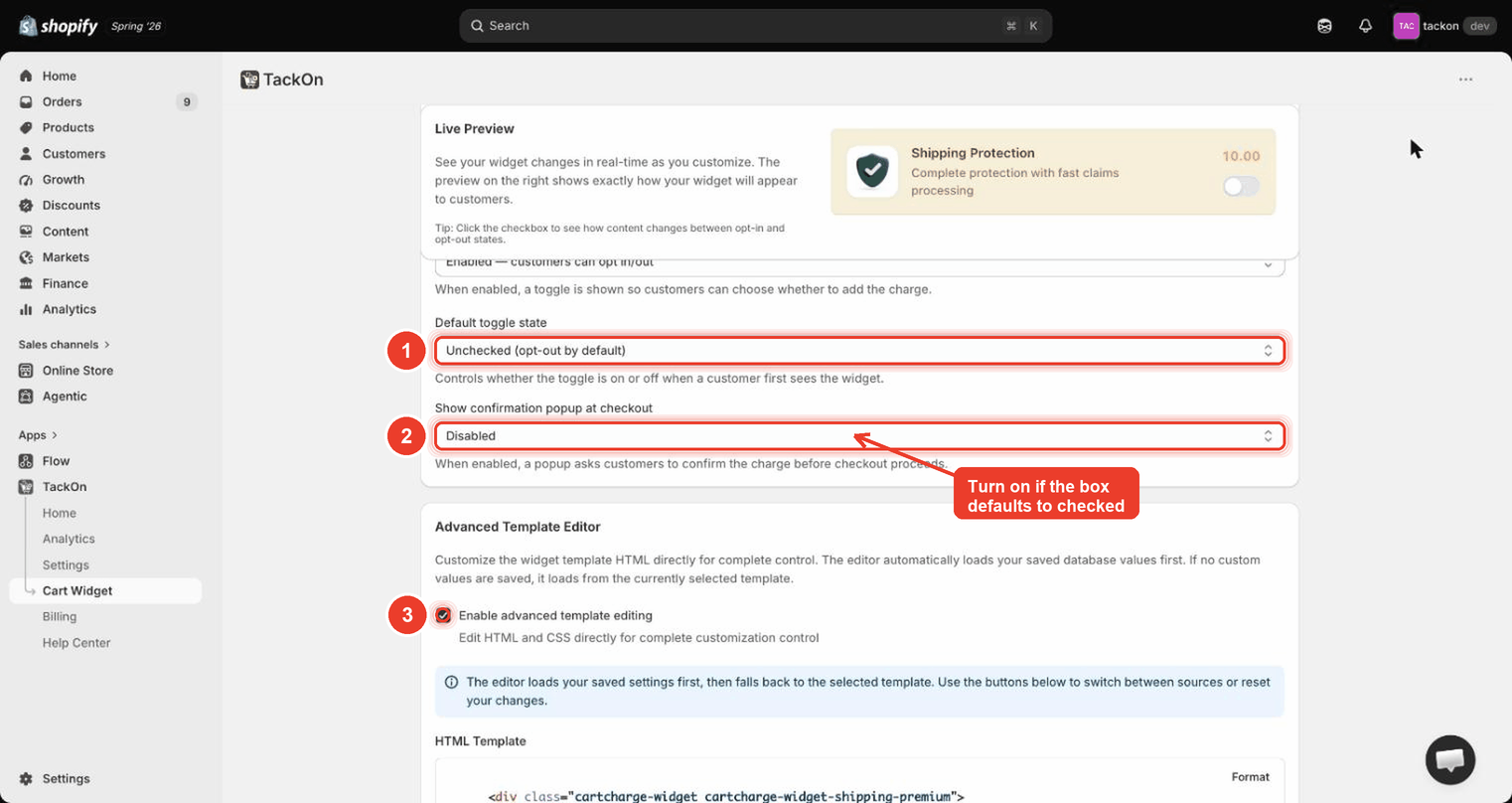
Marker 1 is Default toggle state; marker 2 is Show confirmation popup at checkout, with the reminder to turn it on if the box defaults to checked; marker 3 is the Enable advanced template editing checkbox.
| Setting | What it controls | Example value on screen |
|---|---|---|
| Toggle checkbox | Whether shoppers get a choice at all | Enabled — customers can opt in/out ("When enabled, a toggle is shown so customers can choose whether to add the charge.") |
| Default toggle state | Whether the box is on or off the first time a shopper sees it | Unchecked (opt-out by default) |
| Show confirmation popup at checkout | An extra confirm step before checkout proceeds | Disabled |
The compliance point. An optional charge should default to unchecked. A shopper who never touched the widget has not agreed to pay for the add-on, and pre-ticked optional charges are the fastest route to disputes and complaints.
If you do default to checked, enable Show confirmation popup at checkout at the same time: "a popup asks customers to confirm the charge before checkout proceeds." That gives the shopper an explicit moment of consent. Treat the two as a pair: checked by default with no confirmation popup is the one combination to avoid.
6. Browse the gallery before committing (Widget Demo)
Settings → Widget Demo holds Widget Templates: "Browse the built-in template gallery. Every template is mobile-responsive and fully customizable from the Cart Widget tab, or copy its code as a starting point for the advanced editor."
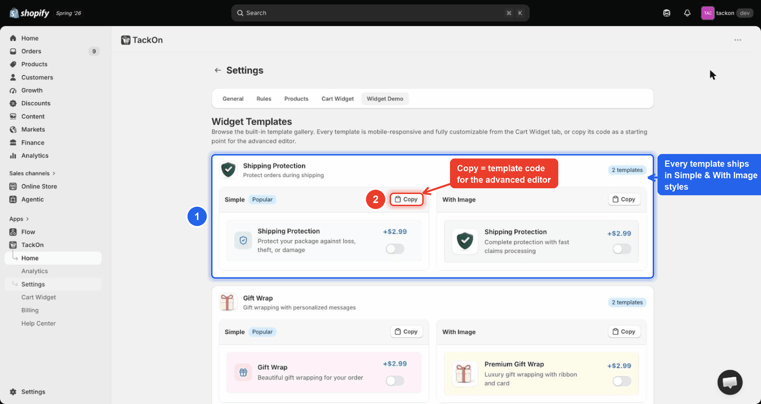
Notice that each widget type is one card carrying a "2 templates" badge, with Simple (tagged Popular) and With Image side by side, each rendered live at +$2.99 and each with its own Copy button.
This is the fastest way to see what you'll get before changing anything. A template's Copy button puts its code on the clipboard, the intended starting point for the advanced editor, rather than writing markup from scratch.
7. Advanced Template Editor
Tick Enable advanced template editing ("Edit HTML and CSS directly for complete customization control") to reveal the HTML Template and CSS editors. Each has a Format button. The default markup uses classes such as cartcharge-widget and cartcharge-widget-shipping-premium.
An info banner explains the loading order: "The editor loads your saved settings first, then falls back to the selected template. Use the buttons below to switch between sources or reset your changes." So if the editor shows something unexpected, it's showing your saved work, not the stock template. The switch/reset buttons move between the two.
7.1 The template variables (and the one the docs get wrong)
⚠️ Heads up: the checkbox variable is
{{checkboxProperties}}.{{checkbox}}does not exist. A custom template written with{{checkbox}}renders a widget whose toggle does not work. The shopper cannot opt in, and no fee is ever added. If your template has{{checkbox}}in it, replace it with{{checkboxProperties}}.
The complete, correct list:
| Variable | What it renders |
|---|---|
{{title}} |
Widget title |
{{description}} |
Widget description |
{{price}} |
Formatted fee amount |
{{checkboxProperties}} |
The checkbox input attributes: the one that makes the widget work |
{{primaryColor}} |
Primary colour hex |
{{primaryColorRgb}} |
Primary colour as r, g, b, for use inside rgba() |
{{secondaryColor}} |
Secondary/background colour |
{{textColor}} |
Text colour |
{{borderRadius}} |
Corner radius value |
The visual controls still feed a custom template: as long as you use {{primaryColor}}, {{textColor}}, {{borderRadius}} and friends instead of hard-coding values, the Quick Presets and colour pickers keep working. Hard-coded hex codes silently disconnect the widget from the brand controls above.
Troubleshooting
| Symptom | Likely cause | Fix |
|---|---|---|
| The storefront widget still shows the old type, style, colours, or copy | The changes were never saved: the Live Preview updates without saving, so it looks applied | Return to Settings → Cart Widget and click Save. The button reads Saved once there is nothing pending |
| Custom template renders, but the toggle does nothing and no fee is added | Template uses {{checkbox}}, which does not exist |
Replace it with {{checkboxProperties}} in the HTML Template editor |
| Colour pickers and Quick Presets have no effect on a custom template | Colours hard-coded in the custom HTML/CSS | Swap the literal hex values for {{primaryColor}}, {{secondaryColor}}, {{textColor}}, {{borderRadius}} |
| Widget copy never changes when the shopper ticks the box | Dynamic Content fields left empty, so the default Widget Title / Widget Description are used in both states | Fill in the Opt-In Title, Opt-In Description, and Opt-In Button Label |
| No image shows even though one was uploaded | Template Style is set to Simple | Switch Template Style to With Image |
| Image upload is rejected | File over 5 MB, or an unsupported format | Use PNG, JPG, GIF, WebP, or SVG under 5 MB, or use Or enter URL |
| Can't find a widget type you've seen described | Festival is easy to overlook in the chip row | Check the Widget Type chip row again: there are six chips, not five |
| Shoppers complain about a charge they didn't choose | Default toggle state set to checked with Show confirmation popup at checkout disabled | Set the default to unchecked, or enable the confirmation popup |
| The advanced editor shows markup you don't recognise | The editor loads saved settings before the selected template | Use the switch/reset buttons under the info banner to go back to the template source |
| The widget looks right in preview but never appears on the storefront | Not a design problem: it's install or visibility | See Scheduling, visibility rules, and troubleshooting |